mrv
srd
Timeframe

March - August 2020

Role

UX, UI, Strategy

Tools

Figma + GSuite
(Google Analytics)

Team

1 Designer
2 Devs

Fit-Plans : website redesign

Introduction

Fit-Plans is a company specializing in the preparation and delivery of daily plans and calorie-accurate meals for sports enthusiasts. Based in Montreal for the past 4 years, the team consists of the CEO who is also the CTO, an operations manager, and a chef coordinating a team of 10 cooks. Most users prefer to call the company directly to order instead of using the site, which is a waste of time for the staff.
Process
1. Discovery 2. Definition 3. Design 4. Test

Process

Discovery

Analytics
Evaluation
Survey

Definition

Personas
Userflow
Priorisation matrix

Design

Wireframing
UI Design
Prototyping

Test

Usability testing
5 second test

Problem Statement
How to redesign the website to make it easier to use ?
  • Reflecting on the different parts of the website and mix them in a homogeneous way
  • Design an equal experience on desktop and mobile
  • Ensure that the redesign meets user needs

1. Discovery

Analytics - Evaluation - Tests - Survey
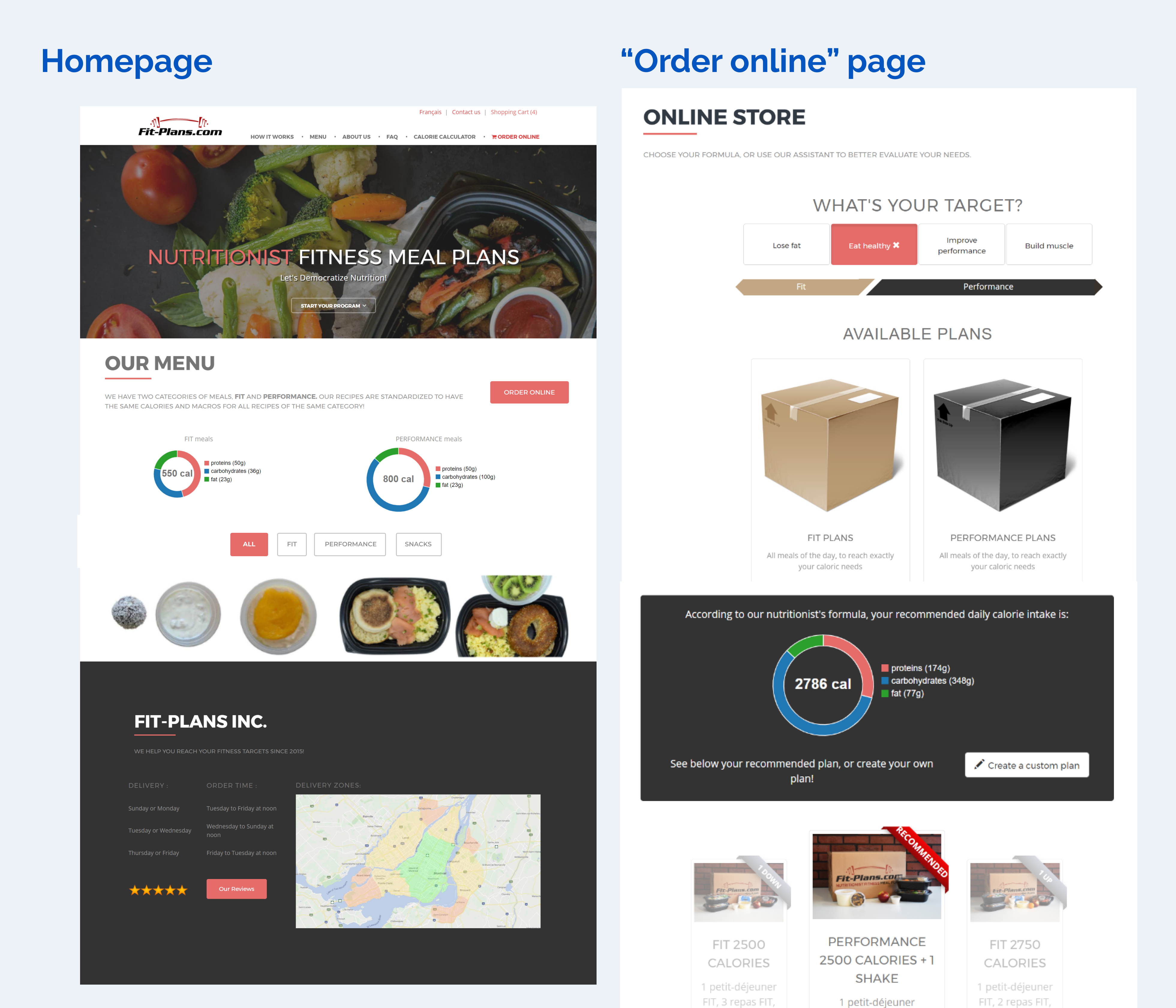
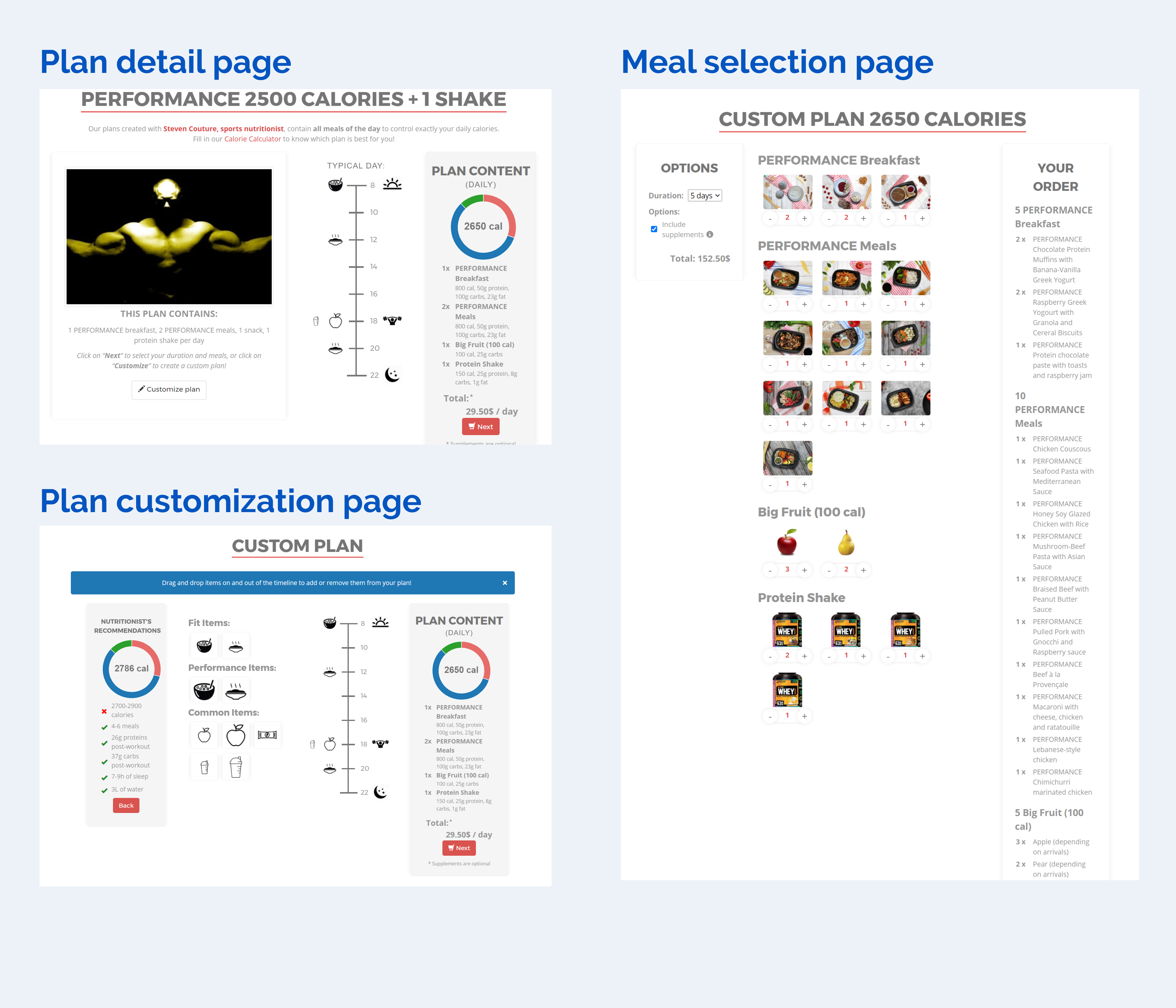
The “before”

The previous website had been designed by the CEO in his spare time. It had never been a priority until then. The improvements to be implemented were only at the project stage

Fit-Plans old website pages

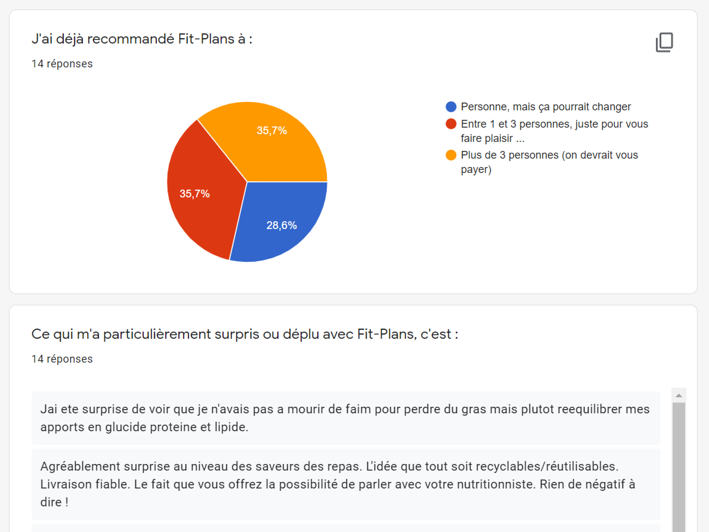
After analyzing the site, it was necessary to collect feedback from users

Survey

So I set up a loyalty program in order to trade feedbacks for promotion codes.
The survey was divided into 3 themes :

  • Client habits, motivations and behaviour
  • Opinion about the service
  • Opinion about the website
STATs
84% of users

Find the meals too difficult to order and the process too long. They prefer to order by phone

2. Definition

Personas - Userflow- Priorisation matrix
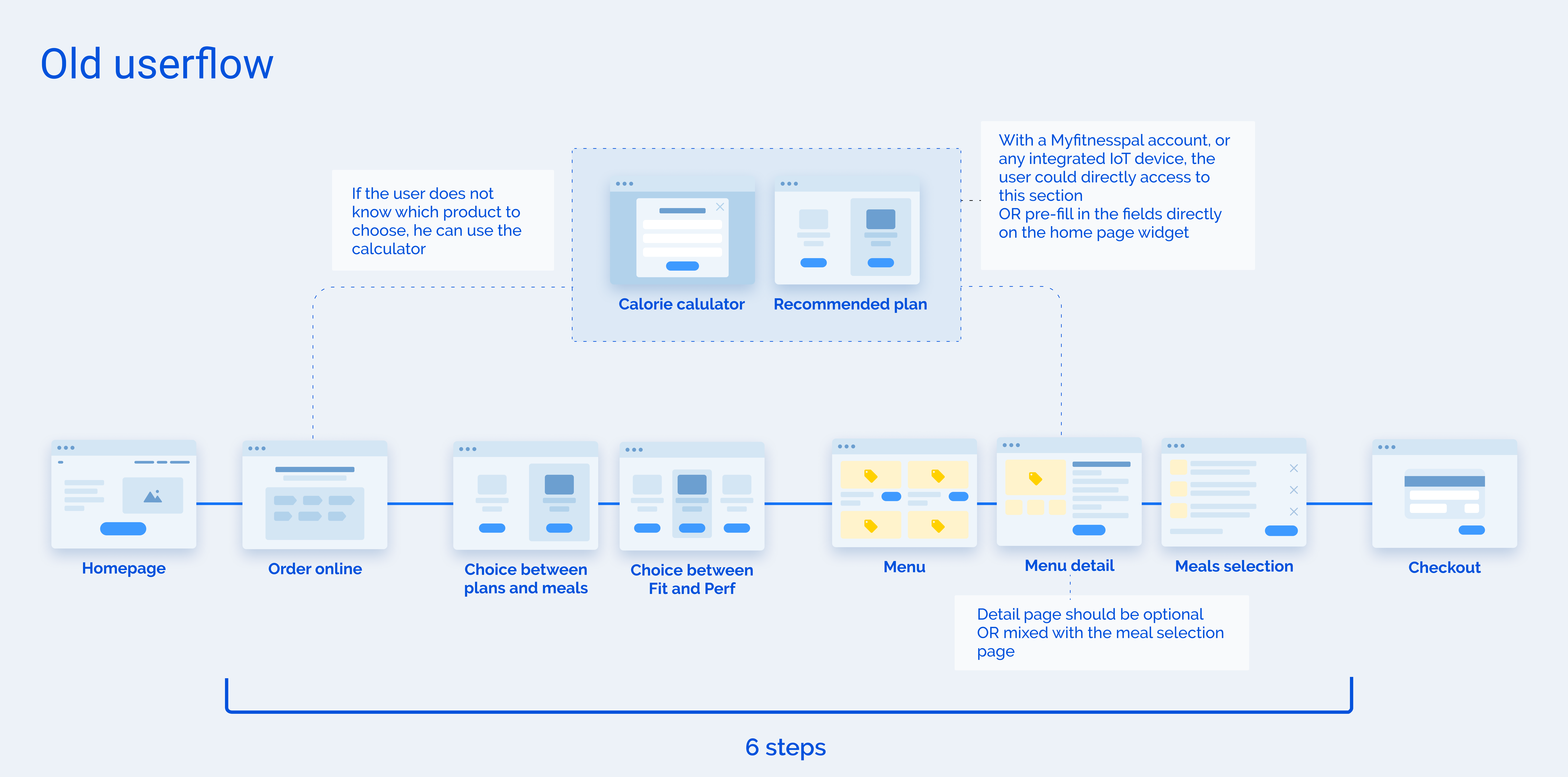
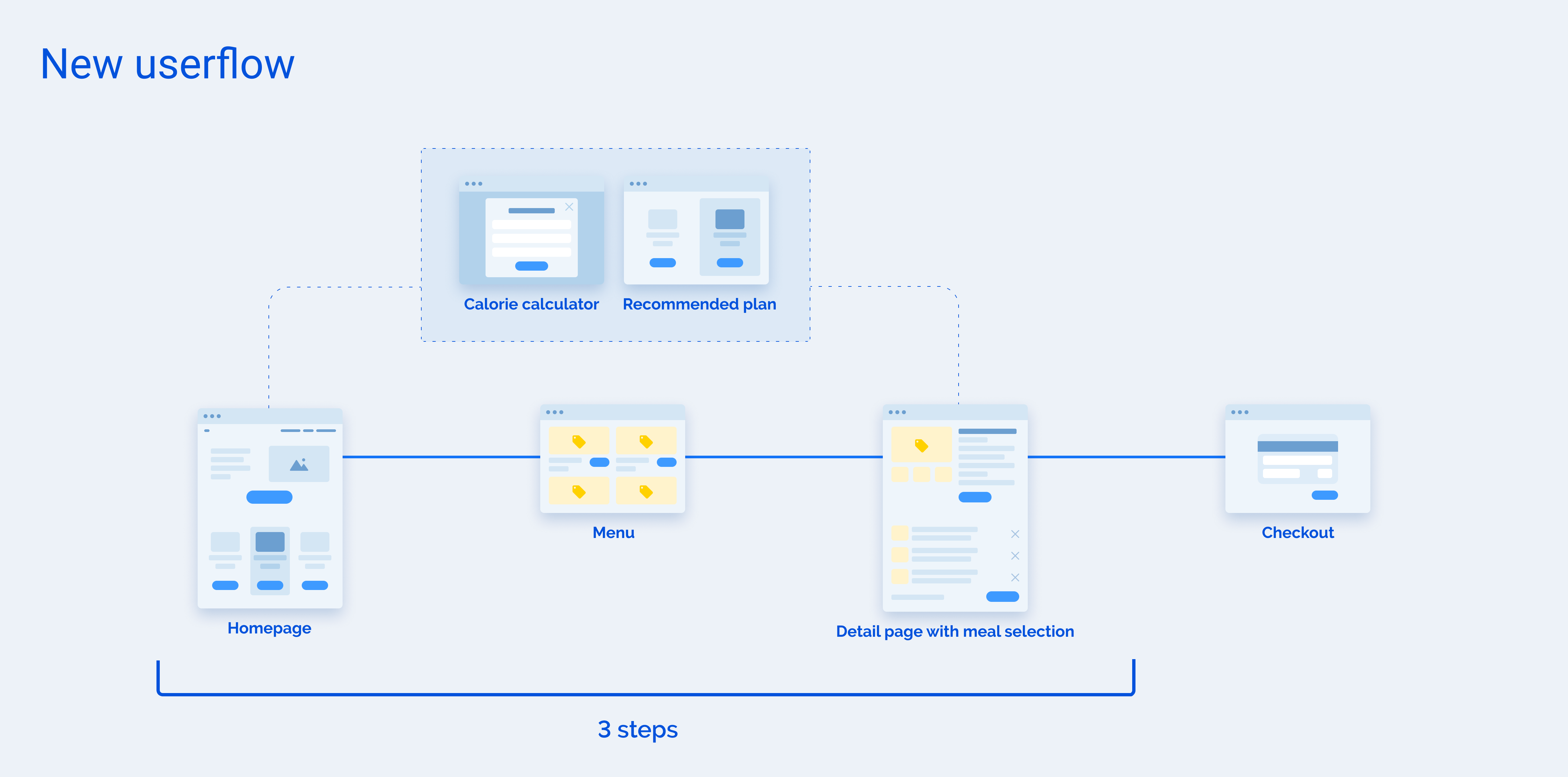
The perfect user journey

The previous clickpath requires the user to go through 6 steps to order a plan.
With the new flow, the number of steps has been divided by 2. The user can access the products directly from the homepage and select his plan.
The last step is to add or delete specific meals directly from the plan detail page.

3. Design

Wireframing - UI Design - Prototyping
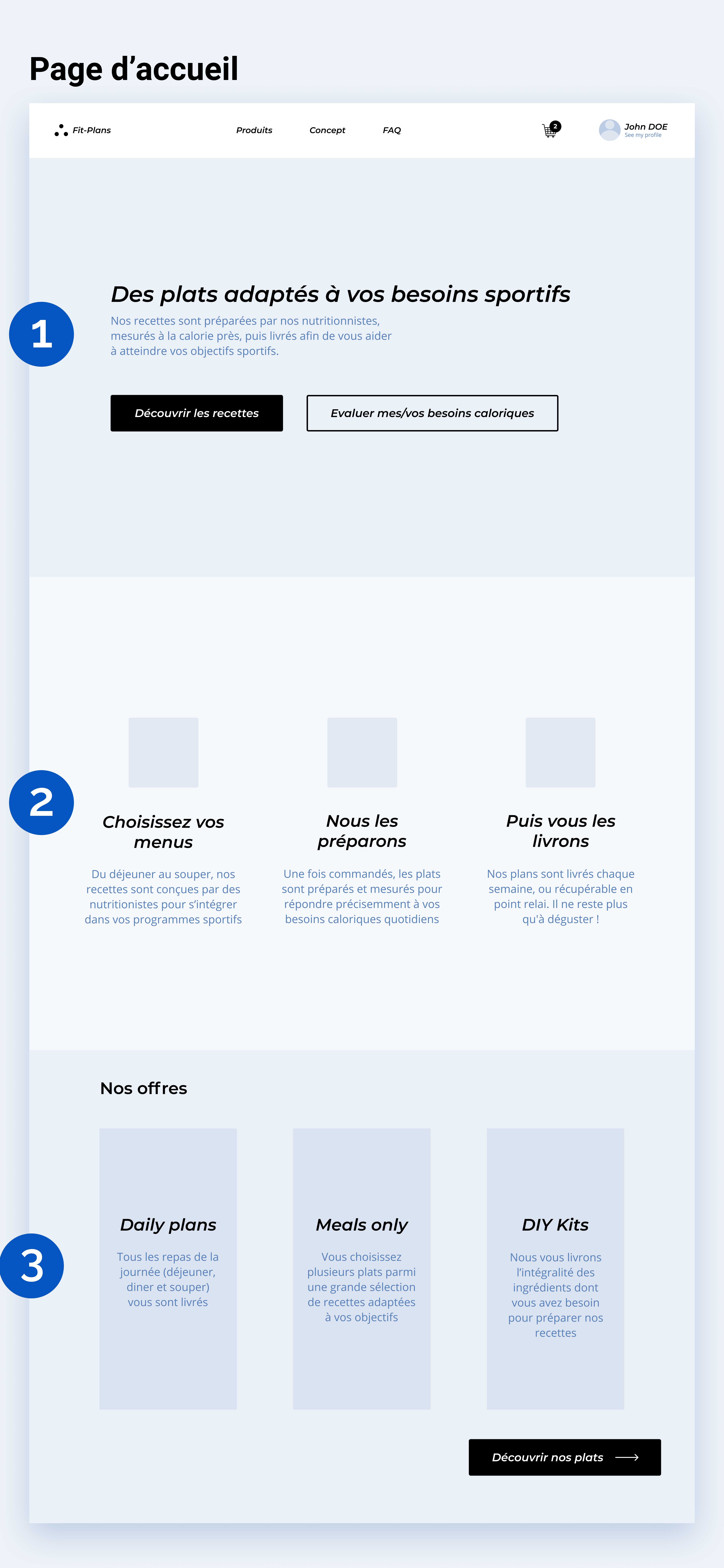
Fit-Plans home page wireframe
1. A clear concept

The first visible sentence on the site clearly explains the value proposition of the service

2. Ordering steps

This section shows the different steps of ordering for the user

3. Offers

Users are led directly to the products.

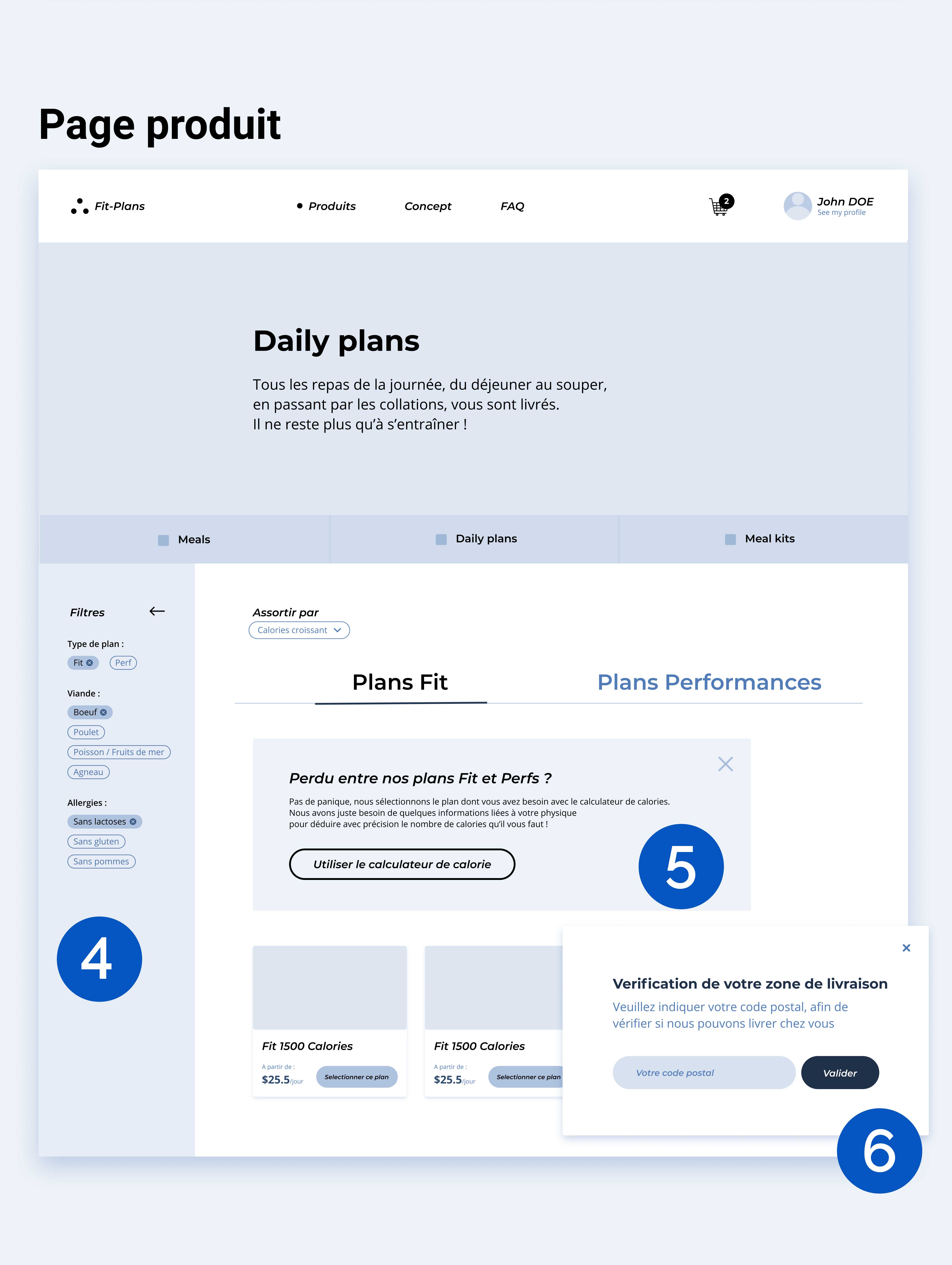
Fit-Plans product page wireframe
4. Filter

The filter allows users to customize their search results

5. Calorie calculator

The calorie calculator leads undecided users to a suitable plan.

6. Location

Before ordering, the system ensures that the user's location is supported.

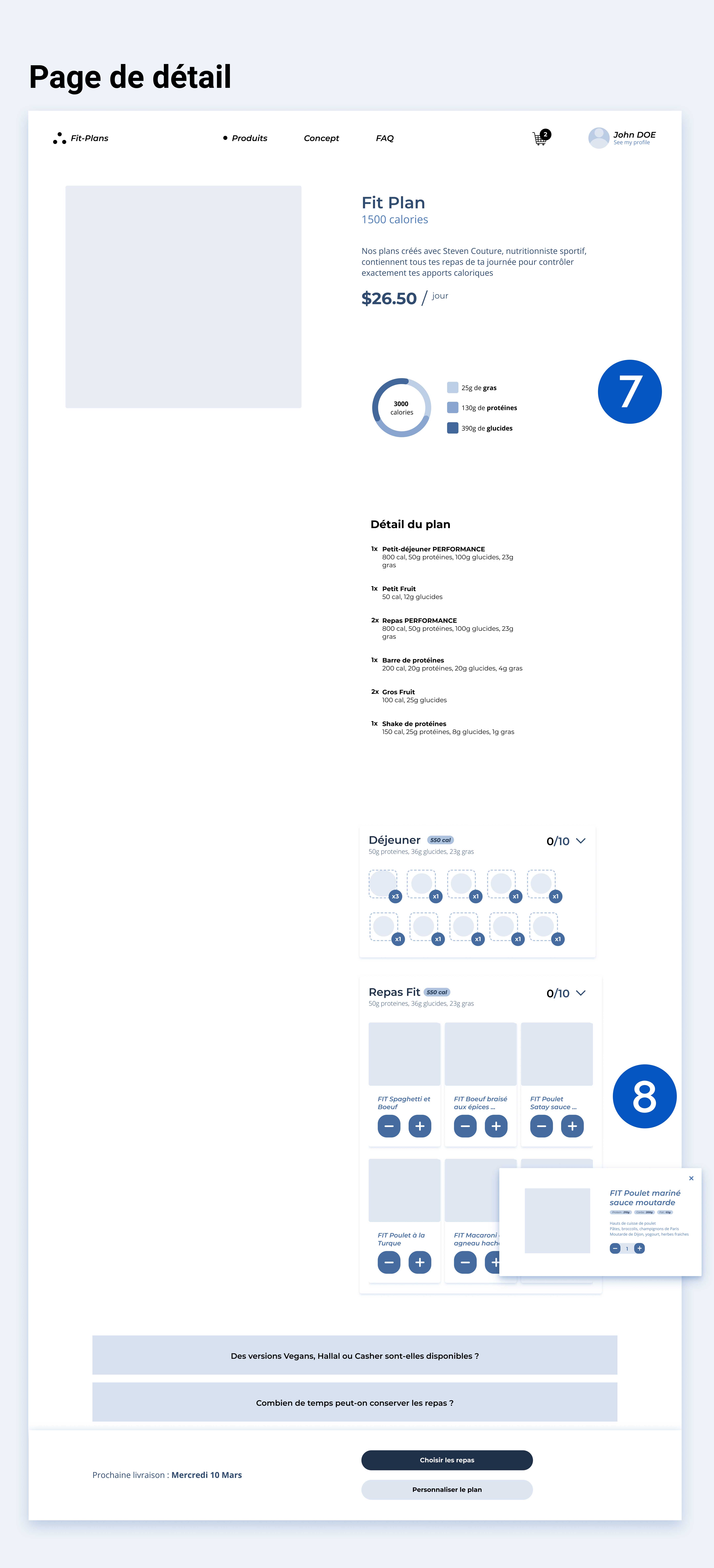
Fit-Plans detail page wireframe
7. Plan information

Plan details are clearly displayed so there is no surprises at the checkout

8. Meal selection

On this section, the user directly chooses his/her meals

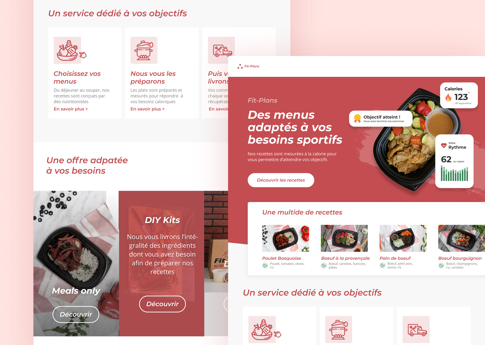
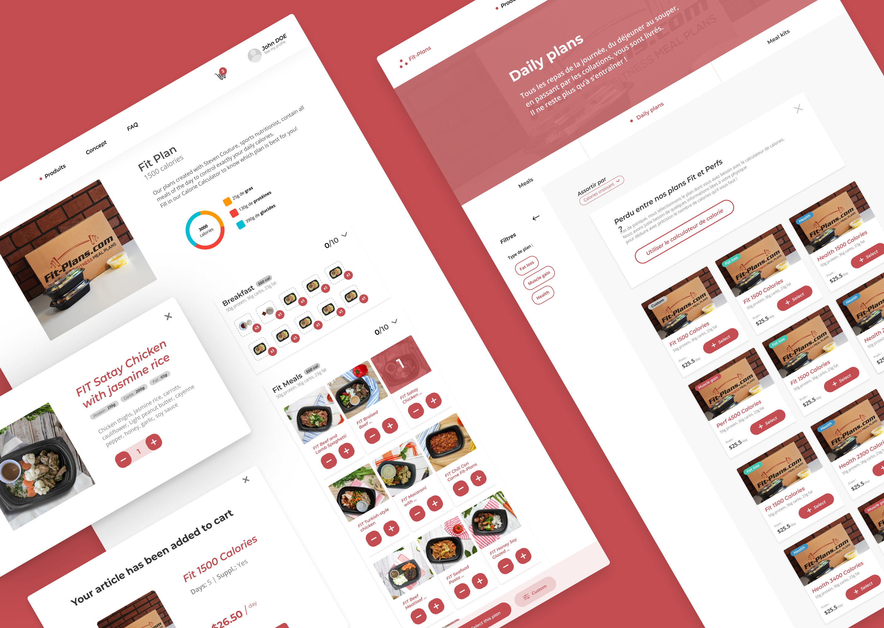
Fit-Plans desktop redesign

The website has also been created in a mobile version

Fit-Plans mobile redesign

4. Tests

Usability testing - 5 second test
Ensure that the website is easy to naviguate

We conducted two tests remotely with a prototype in order to ensure that the interface is usable

STATS
92% of users

consider the concept and the call to action button leading to the order to be important elements

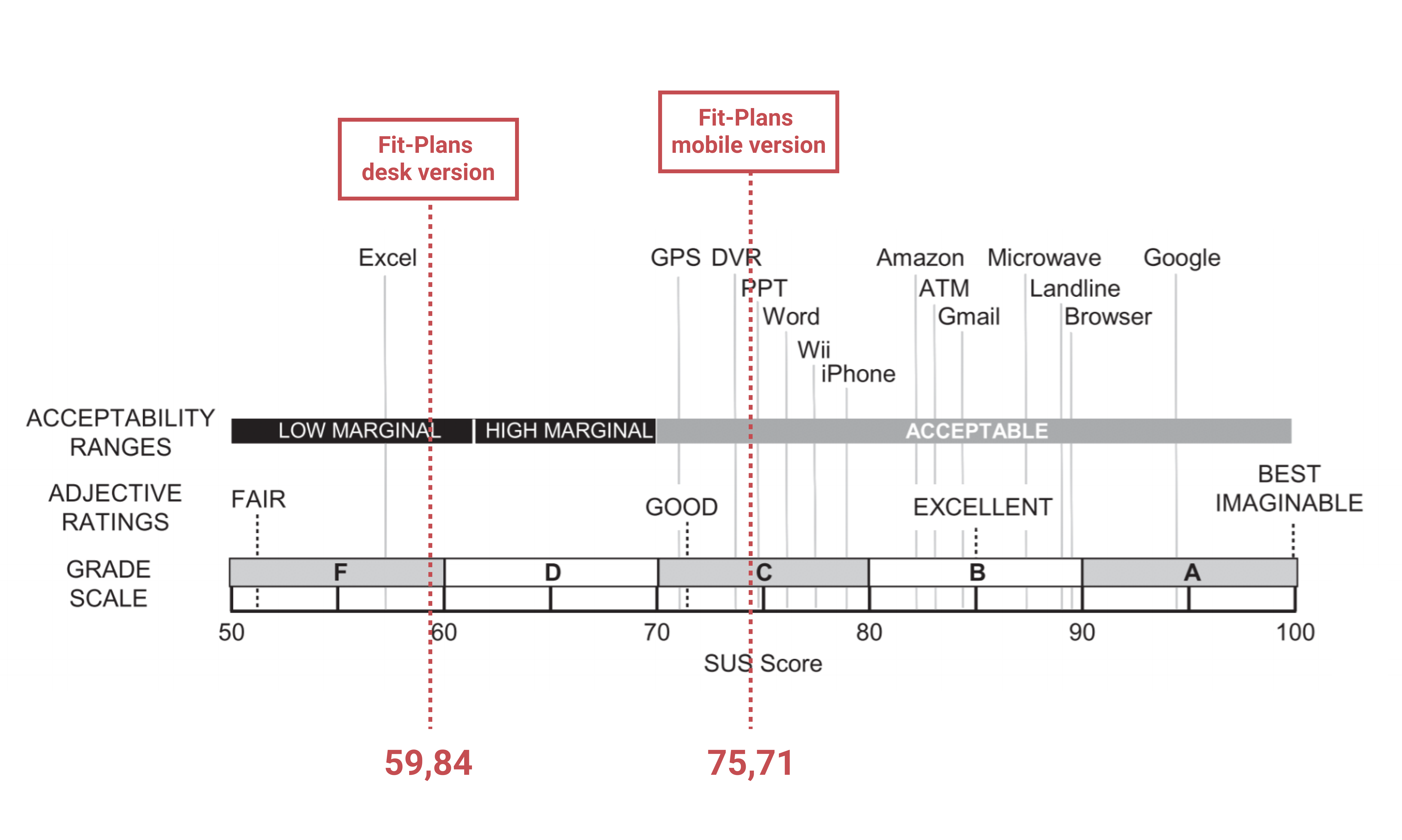
Fit-Plans SUS Scale

Want to know more ?

You can visit the site in beta or check the complete case study

Check the complete case study
Access the beta website