In order to be aware of the problems that users were encountering, we had to observe them using the service. We also needed to take time to analyze usage on a larger scale.
So we decided to go follow 3 phases plan :
Soundcloud is one of the most widely used music streaming service.However, the website and the mobile application still seem to have a few usability issues.As a group of 5, we tried to improve the user experience of the platform by addressing the following issue:
Soundcloud is an online streaming service created in 2008 by Alexander Ljung and Eric Wahlforss. What makes it unique is the fact that it allows any artist to post music content, making it accessible to nearly 175 million users. Thanks to the platform many artists have become famous, including the new "Soundcloud rappers", exclusively known thanks to the service.
In order to be aware of the problems that users were encountering, we had to observe them using the service. We also needed to take time to analyze usage on a larger scale.
So we decided to go follow 3 phases plan :
Survey
Creation of the test and observation scenario
Wireframing and prototyping
Improve the feature of leaving a comment at a specific moment of a playing music
We designed a 30-questions online survey in order to understand the targets usage habits and profiles, but also their favorite functionalities. We also sought to find out whether they found the site usable using the UMUX usability scale.
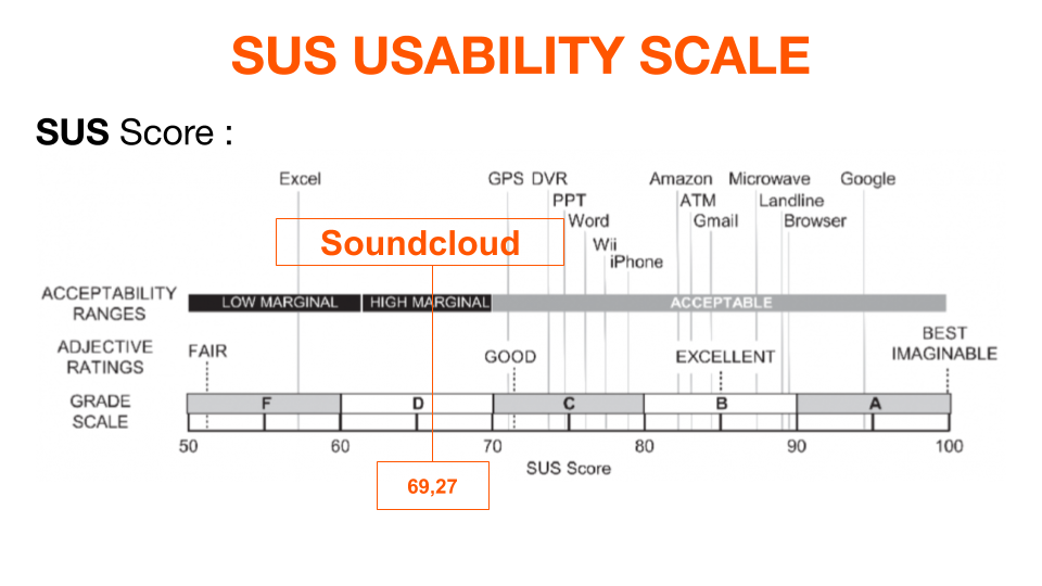
We first analysed the results of the usability scale, which is designed to measure the usability of a website or a system in a numerical way, and then transposed our results to the SUS scoring system.
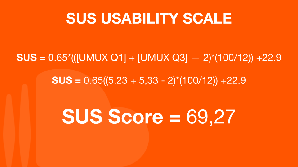
We obtained a score on the SUS scale of 69.57, corresponding to the level of usability of the platform.
Following the analysis of the survey results, we have established the following facts :
Use another platform because they feel the service is better
Ue the search bar, so they know which content they prefer
Of weekly users report listening to music between 11 and 30 minutes per session.
Based on our review of the data, we have made the following recommendations:
SoundCloud, while having a large number of visitors and users, is more seen as an alternative to leading platforms such as Spotify, Deezer and Apple Music.The application is much more widely used than the site.
It is important to improve the interface of the website application, especially the comments functionality.
Sound quality is also one of the weakest points of the SoundCloud platform.
In order to know the most urgent problems to solve, and to judge the ease of use of Soundcloud in general, we have established a test scenario taking into account the main features of the site in desktop version :
During the test, we also asked users to describe their actions, to explain their meaning, and finally to tell us if they encountered any difficulties.It should also be reminded that the scenario administered was the same for each of the testers.
For the 6 testers, some of whom had never used the website before, we obtained the following results :
The mission was mostly successful
During the user testing phase
To finish out all of the missions
At the end of the test session, the following points were observed :
It's easy for testers to find songs
They can easily start it because the button is big enough
Only those who already know the platform can leave a comment
Theres is a confusion between artist page and search results
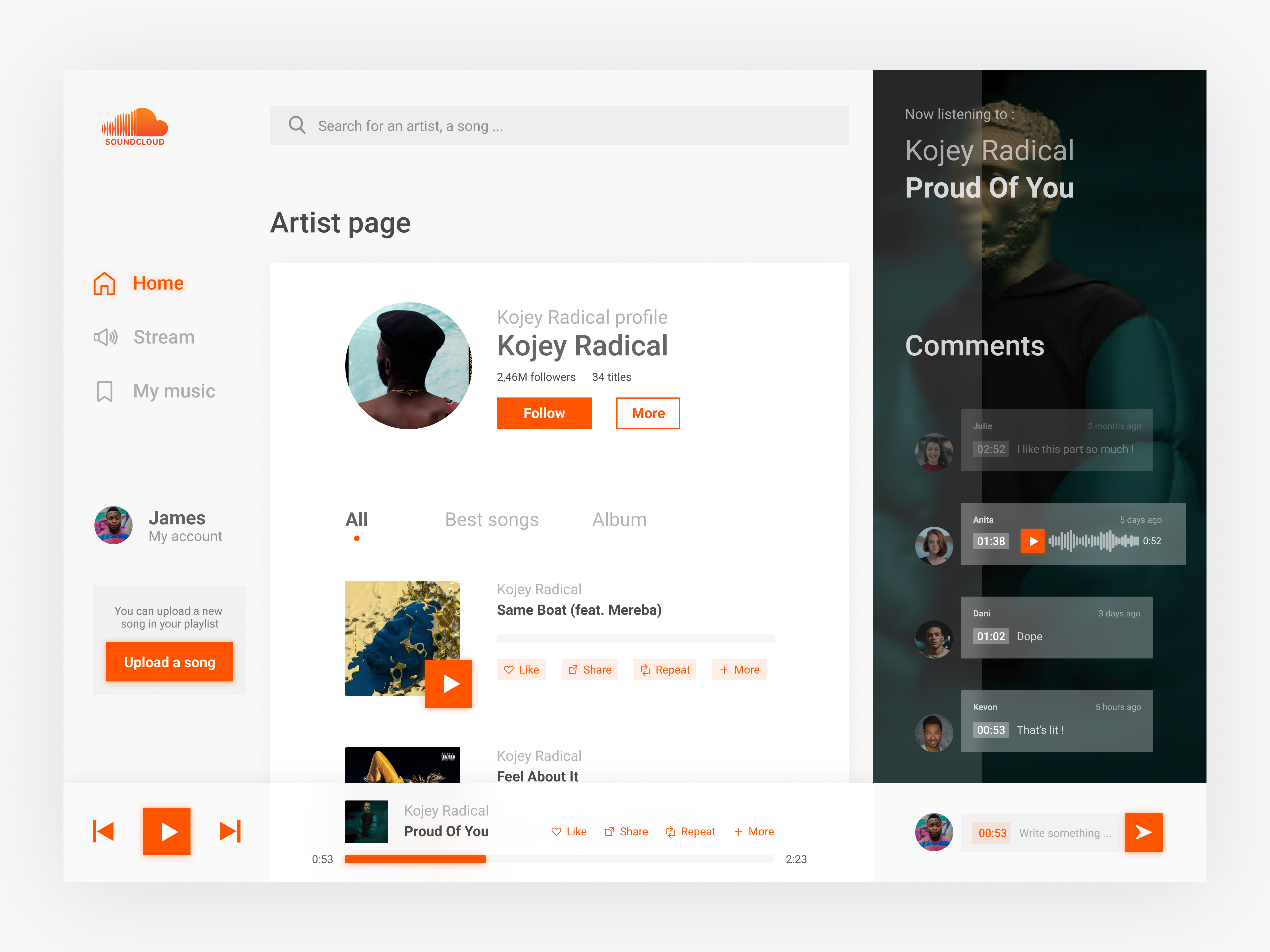
In order to illustrate our solutions to the problems encountered during the test phase, a prototype has been designed.
At the end of the project, I decided to redesign the artist page, highlighting the comment section on the right.
The entire work document is available in french at the link below